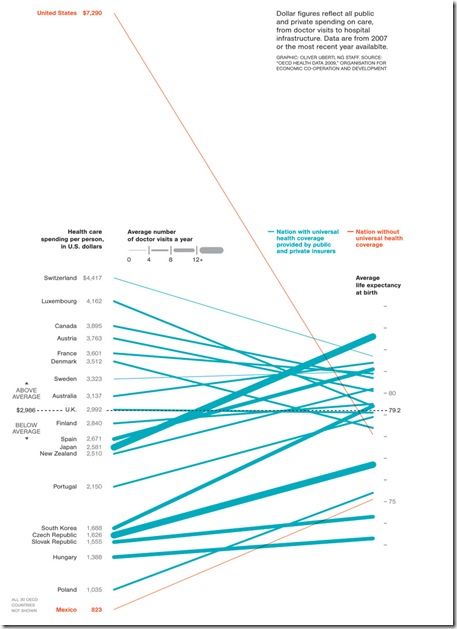
Graphics, well done, can tell stories with wonderful clarity. If you are not familiar with the work of Edward Tufte in this area, you should be.
Take this chart from National Geographic, discussed eloquently by Andrew Sullivan in The Daily Dish from The Atlantic. Don’t tell me the US healthcare system doesn’t need fixing after you look at this!
This one is less serious in nature, picturing the past 10 years, and worth clicking through to the NY Times to see in its full resolution.


No comments:
Post a Comment